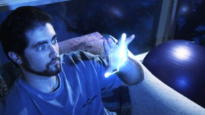
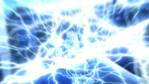
This document describes how to achieve the effect of computer generated lightning arcing between fingers
using Adobe After Effects 6.5 Professional (AE). The instructions assume familiarity with the basic masking,
compositing and keyframing features of AE. A video of a completed composite is given, along with some frame grabs.
The video footage presented was shot on a Sony HDR-FX1 in CineFrame30 mode in the HDV format.
THE VIDEO
480x270 web resolution *.mov (2.8 MB)
960x720 native resolution *.wmv (13 MB)


[click on the images to enlarge]
Introduction
The above effect was created using a combination of on-set interactive lighting and post-production
compositing. While it is possible to attempt the effect with no on-set lighting, the result is usually less convincing. Furthermore, while the post-production process for a test like this takes
many hours of painstaking animation, setting some lights up is quite cheap and only takes a few minutes.
On Set

|
A cheap party strobe light.
|
Interactive lighting was provided by two cheap party strobe lights purchased at Canadian Tire. It is preferable
to use more than one light, as the changing positions of the light sources add to the effect that the lightning
is flickering.
While setting up the strobe lights, make an effort to minimize unwanted shadows. If you look carefully at some
shots in this clip you will see shadows of my arm appearing on my shirt that should not appear if the lightning
is indeed the source of illumination. The closer you can get the strobes to where the lightning is supposed to
originate, the better.
While shooting, try to time the activation of the strobe lights with the actions happening on screen. You may
require several takes to get the strobe activations consistent with the actions of the actors. In the case of this
clip, the strobes are activated by a power bar below my right hand. I threw the power bar switch at the same time
I snapped my fingers to synch the lighting. Obviously, it would have been difficult for me to do much more than sit
with this particular setup, but with a crew of more than one, you could probably achieve quite a display of
interactive lighting.
Post Production
This particular visual effect is composed of three elements:
- The lightning arc - rendered by the Advanced Lightning Filter, keyframe animimated, and composited and colour
balanced using standard "glow" effects.
- The contact points - a faint blurred white solid and a duplicate original footage layer masked at the lightning
contact points in order to better merge the "contact" areas of the lightning arc with the hand.
- Colour correction on the original footage layer designed to enhance the appearance of the footage and better sell
the colour of the lightning effect.
In addition to the visual aspect, some marginal effort was placed into music and sound design to better sell the
footage. While the above description is probably enough for someone familiar with AE to figure out exactly what I
did, I shall treat each of these effects in some detail below. First import your footage into AE and set up
a new composition with your footage as a layer. If you don't know how to do this check the manual or help files,
and perhaps find a more forgiving tutorial.
1. The Lightning
First apply the Advanced Lighting Filter (ALF) to a black solid/an adjustment layer/the footage layer. You may not have
the ALF, but this effect may be duplicated to some extent with the standard lightning filter.
Feel free to (and please do) experiment on your own wtih a variety of plugins. Pick a blending mode in the ALF
such that you can see the lightning arc and the footage underneath. Turn the opacity of the "glow" in the ALF to
"0" (zero), as this built-in glow is rather abysmal and will not sell the composite as well as we'd like to.
It's now time to animate, rotoscope, and tweak to taste (ART3).
Consistent with its acryonym, ART3-ing is what's going to differentiate your version of this effect
from mine and everyone else's. How you do your ART3 is entirely subjective and dependent on your footage,
but here are some tips:
- Be the lightning. This may sound like some cheap sports slogan, but the lightning can be just as much a
character as the actors on screen - or, if you've got a crummy actor, even more of a character. Try to make
intelligent choices as to where the lightning is and where it's going.
- Vary the opacity of the lightning with the strobe lights. Make sure the opacity is high when a strobe light hits
and low when the strobes are off to sell the effect.
- There are several different types of lightning in ALF... experiment. This footage uses almost exlusively "striking"
until the very end, at which point "breaking" dominates the shot.
- Study some video footage of real lightning and sparks. Real lightning doesn't wiggle up and down like most
force lightning tests... it arcs - and it does so incredibly quickly. The reason lightning makes thunder is that
it travels much much faster than the speed of sound. Just as you wouldn't show bullets travelling (unless in
bullet time... we'll get there), neither would you show lightning travel.
- If you do have an excuse to show lightning traveling,
don't try to wiggle your lighting. There's an excellent shot in The
Matrix Revolutions during the SuperBrawl (insert disparaging editorial about the movie here) you should look at if you want
to show lightning traveling. In order to achieve this motion in AE, you
need to use the "core decay" tool. Animate the lighting between the
emitter and the target as you would normally - and then gradually decrease
the core decay to get the lightning to travel out along its path.
- There is a tendency for people to assign a bolt to every finger which results in a big glob of lightning
looking all glob-like and globbing towards its opponent, where it forms a glob and globs on them. I used 2
lightning bolts in this test. The 2nd one only appears for the last 17 frames. I think that 1 busy bolt looks
cooler than 5 static ones. You're entitled to your opinion of course, however incorrect it may be.
On to the compositing aspect of the lightning effect. Now that we've animated the effect from start to finish,
it's time to snazzily integrate it with the footage.
- Regardless of where you originally placed the lightning effect
to ART3, you now need it on it's own footage layer.
- Make a new composition the same size and length as your composition with the footage, and copy the lightning layer over. Place a Black Solid underneath the lightning
layer, and make an Adjustment Layer on top.
- Apply a Fast Blur/Gaussian Blur to the Adjustment Layer and set a Horizontal and Vertical blur of 4 to 16.
- Set the transfer mode of the Adjustment Layer to "Linear Dodge", "Add", or "Screen" (I
think Linear Dodge looks best... if you use eLin, then do your own thing at this point).
- Make 2 or 3 additional copies of the Adjustment Layer and change the blur parameter by a factor of 4 each time.
i.e., if the original blur was 4, then the next layers should be 16, 64, and 256.
- Place the lightning composition into the composition with your footage and set the transfer mode to "Linear Dodge"
or "Screen"
- Apply a "Color Balance" filter to the lightning composition and tweak it until the lightning is your desired colour.
2. The Contact points
Make sure the lightning layer is visible for this step.
- Make a white solid layer, place this above the lightning layer.
- On the white solid, mask the contact points of the lightning arc on your finger tips with little
feathered eliptical masks. This will give a nice little end to the lightning
tip and merge it with your fingers better. Be sure to follow your
lightning around.
- Make an additional copy of the footage layer (place this layer above the original footage layer).
- Copy the masks from the white solid to the new footage layer, feather
them more, and change this to "add" - this will give a "sub-surface"
like glow - suggesting some heat in your skin.
3. Colour correct
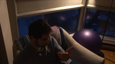
There are many different filters in After Effects for doing colour correction including some fancy plug-ins from external vendors. I do most of my colour correction using the Curves filter, and occasionally the Levels and hue/Saturation filters. My objective for this shot was to adjust the colour so that it looked like the majority of the light emitted by the lightning (i.e., my strobes) was the same colour that I rendered the lightning as (which was an "electric" bluish). In order to do this I had to blue-up the entire shot. So many looks are achievable that there's no point in me writing a tutorial for this, so I'll just say "experiment until you find a look you like." For sake of reference, here's a full resolution frame without colour correction:

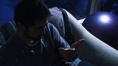
And here's the same shot with colour correction (note also the picture is zoomed in and cropped for composition).

Final Notes / Disclaimer
I made a bit of an additional flare when the lightning starts to give
a little panache. You can do that too of you like. I used a radial blur
tool for mine. This was applied to the lightning layer.
I hope the tutorial was somewhat useful to you. I should point out that I did not reference the Star Wars films at all to do this effect. I am not trying to make canon 'Force Lightning' here, but something I think looks interesting, close, and hopefully, appealing in an "I'm electrocuting you" kind of way.
If this is not what you were looking for, Pixel Magic has a nice tutorial
with some PS Ripple thing that people are always looking for that
doesn't exist. If you're doing long distance shots, there are some very
nice compositing tips in Pixel's tutorial in terms of getting tasteful
horizontal lens flares and what not. I suggest you look that up too if
you're interested in doing force lightning.
Adapted from the original thread posted on The Fan Films Forum. If you have any questions, try to get ahold of me there.
|

